Getting your content out there is something all Bloggers want to do. The easiest way to make that happen is to give your Readers access to quick and simple to use ways to share your content across their social media networks. That’s where Social Share Tools come in!

We’ve all seen the posts telling us to make sure we have a Share Tool installed on our sites but lately I’ve noticed that simply having the share tools doesn’t make them work for you or your content. Here are a few simple tips to not only make sharing easy but also help your Readers want to share your content.
 Don’t Limit The Options
I have visited several sites where they had limited options for which social media networks I could share to. They would either have Facebook, Twitter and Google or just Twitter and Pinterest or some other variation. Yet it was always limited to 2-3 choices. Share Tools offer many different sizes, shapes and designs to setting up your buttons so why limit your Readers to only a few choices? What if I feel that your post would be absolutely perfect for my How To Board but you have taken away the choice? If I don’t feel like installing my own chrome option, copying your link or doing the ‘extra’ you may have just lost a potential share!
[tweetthis]Give your Reader as many share choices as you can without adding clutter to your site. #BlogTips[/tweetthis]
I always include the most popular share links (Facebook, Twitter, Pinterest, Google+ and Stumbleupon) then I make sure that I have a button that gives them the option to select from a larger set of links through my share tool itself. This way I am not setting any boundary to where my content can go.
 Make Them Visible
The point of having Share Tools is to give Readers an easy and accessible way to share your content quickly and as they read or immediately after. You don’t want them to spend 5 minutes searching your page for how to share and end up decided not to share.
Place your Share Tools in at least 2 key positions within your posts. I have mine right at the top for the who my have followed a link from my Facebook, Google + or Twitter and already know they want to share it but may not want to read or scroll down to the bottom.

I also place a second set of Share Tools at the end of my posts. This gives the Reader who just finished taking in what I had to say that immediate option to share it with their audience, a friend or that person who just ‘needs to read/see this‘.

I have even given the two placements a bit of a different look. Sometimes little changes can help guide a Reader to notice and use something. Something as simple as shapes, colors and sizes.
 Make Them Unique
There have been a few times where I was scrolling through a post and simply scrolled right by the Share Tools. Why? They were the same color as the post and background, used only words and basically did not stand out in any way.
I mentioned above how important placement can be but the actual design and look of your Share Tools can also have a major impact on whether a Reader notices them in order to use them. Sometimes you can come upon some really great content almost by accident. You may be so engaged in what you are reading that when you’re done if you don’t see a way to share it you may simply click away.
This is where picking a design for your Share Tools is so important. Make them pop so that Readers can see them. Many Share Tools offer options like shapes, colors, sizes and even phrases that can be added to them to help them fit the design of your site as well as stand out. Don’t be afraid to use them!
 Customize Your Settings
I know many of us hate going into the settings of a PlugIn. It can be confusing, bothersome and at times just plain confusing. Yet sometimes making even the simplest adjustments can help that PlugIn work better for your site and your content.
Depending on what Share Tool you are using, there are normally ways to adjust the settings for certain shares. For example, if you have a Twitter button including in your sharing options you are able to customize how that tweet goes out. Please Please Please don’t leave it to the original settings. Share Tool PlugIns are businesses for people. They take advantage of those of us who don’t feel like changing things and most time will have everything redirect back to them.

If you take a few minutes to change the via option within your Share Tool’s Twitter options you have a way for your Reader to redirect their audience not only back to your content but to your Twitter as well!

[tweetthis]Always promote the source of the content not the tool you’re using to share it. #BlogTips[/tweetthis]
 Say Thank You
Thank You. Two words with the impact of many more. Be sure to set your options to include a Thank You to those who choose to share your content. They didn’t have to but they did. Let them know you appreciate it and they may just do it again 🙂
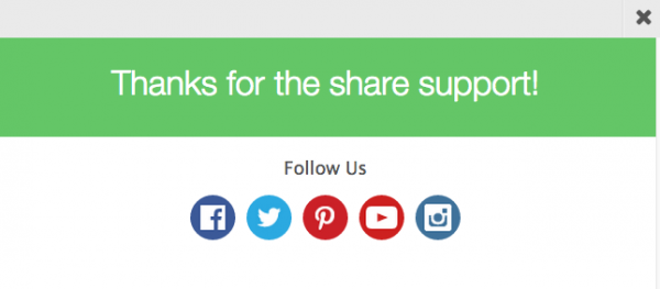
Pssst! Those follow buttons direct straight back to me. Just another way to customize and be sure your Readers always have a way to come back to you.


Share The Love
Just like most things in life, giving what you’d like to receive can help you go a long way. Return the Share Support to those around you. Click those links and keep the content flowing. It’s always nice to Share The Love…

Need a Share Tool PlugIn ?
Here are a few…
WordPress
Shareaholic – Share This – Simple Share – Social Share – Add To Any
Blogger Options
How do you make Social Share Tools work best for your content?
**Disclosure of Material Connection: I have not received any compensation for writing this post. I have no material connection to the brands, products, or services that I have mentioned. I am disclosing this in accordance with the Federal Trade Commission’s 16 CFR, Part 255: “Guides Concerning the Use of Endorsements and Testimonials in Advertising.”
- An Unstoppable Experience: When Skincare Becomes Care for the Whole You – January 31, 2026
- The ‘Dirt’ on Dirty Whiskey Craft Cocktail Bar – August 6, 2021
- I Never Went To Prom – Will A Fashion Show Do? – May 1, 2021






Leave a Reply